How to Build a Twitter Analytics Dashboard in 30 Minutes
How to Build a Twitter Analytics Dashboard in 30 Minutes
Creating a Twitter analytics dashboard doesn’t have to be a long, complicated process. In just 30 minutes, you can set up a fully functional tool to monitor real-time engagement, track trends, and analyze data - all without advanced coding skills or expensive software. Here's how:
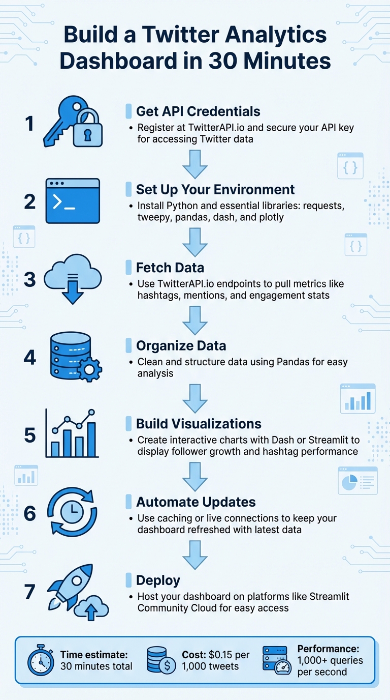
- Get API Credentials: Register at TwitterAPI.io and secure your API key for accessing Twitter data.
- Set Up Your Environment: Install Python and essential libraries like
requests,tweepy,pandas,dash, andplotlyfor data handling and visualization. - Fetch Data: Use TwitterAPI.io’s endpoints to pull metrics like hashtags, mentions, and engagement stats.
- Organize Data: Clean and structure the data using Pandas for easy analysis.
- Build Visualizations: Create interactive charts and graphs with Dash or Streamlit to display metrics like follower growth or hashtag performance.
- Automate Updates: Use caching or live connections to keep your dashboard refreshed with the latest data.
- Deploy: Host your dashboard on platforms like Streamlit Community Cloud for easy access.
With tools like TwitterAPI.io, you can quickly transform raw Twitter data into actionable insights, helping you make informed decisions without relying on complex enterprise solutions.
7-Step Process to Build a Twitter Analytics Dashboard in 30 Minutes
Complete Twitter Analytics Dashboard with Dash Plotly (Tabs) in Python
Prerequisites and Setup
Before diving in, make sure you’ve got your API credentials ready, set up a Python environment, and identified the key metrics you want to track. This initial setup takes about 10 minutes. Once done, you’ll configure your credentials, environment, and data filters to ensure everything runs smoothly.
Get Your TwitterAPI.io Credentials
Start by heading over to TwitterAPI.io and registering for an account. After logging in, go to the API credentials section and generate your Bearer Token. This token provides read-only access to public Twitter data, which is sufficient for most analytics dashboards. If you need to perform actions beyond reading data, you’ll need additional tokens.
Make sure to keep your credentials safe. Instead of embedding them directly into your Python scripts, store them securely in a .env file or use environment variables. This precaution helps protect your credentials from accidental exposure, especially if you share your code or upload it to a public repository.
Once your credentials are sorted, it’s time to set up your Python environment.
Set Up Your Development Environment
First, ensure Python 3 is installed on your system. Then, create a virtual environment to keep your project dependencies separate and organized. In your project folder, run the following command:
python -m venv venv
To activate the virtual environment:
- On macOS/Linux:
source venv/bin/activate - On Windows:
venv\Scripts\activate
This step ensures your project’s dependencies don’t interfere with your system’s Python installation.
Next, install the required libraries with:
pip install requests tweepy pandas dash plotly matplotlib
Here’s what each library does:
- Tweepy: Simplifies interactions with the API.
- Pandas: Handles data manipulation and analysis.
- Dash and Plotly: Create interactive web visualizations.
- Matplotlib: Produces static charts for your analysis.
For a more polished dashboard, you might also want to install dash-bootstrap-components, which offers pre-built themes to enhance your visualizations.
Choose Your Data Focus
Think about what metrics align with your goals. Are you tracking brand mentions to manage reputation? Analyzing hashtags to measure campaign reach? Or maybe monitoring follower growth to understand audience trends? The X API search endpoint allows up to 180 requests every 15 minutes for certain tiers, so it’s smart to focus on specific data points instead of trying to collect everything.
Use filtering operators like from:, has:links, or lang: to refine your data and cut down on irrelevant information. For example:
- To monitor competitor activity, filter by their username and exclude retweets.
- To analyze sentiment around a product launch, focus on tweets mentioning your brand and related keywords.
Defining these filters early will save time and ensure your data is relevant. Once your metrics are clear, you’re ready to move on to retrieving and visualizing your data.
Fetching Twitter Data via TwitterAPI.io
With your environment set up, you’re ready to connect to TwitterAPI.io and start pulling the data you need. This involves authenticating your requests, accessing the right endpoints, and organizing the responses into a format that works for your dashboard.
Authenticate with TwitterAPI.io
Authentication with TwitterAPI.io is simple. You’ll need to include your API key in the request header to verify your identity. The platform uses the x-api-key header for this purpose, and all responses are returned in JSON format.
Here’s a basic Python example using the requests library:
import os
import requests

API_KEY = os.environ.get('TWITTERAPI_KEY')
BASE_URL = 'https://api.twitterapi.io'

headers = {
    'x-api-key': API_KEY,
    'Content-Type': 'application/json'
}

response = requests.get(f'{BASE_URL}/twitter/user/info?username=YourTargetAccount', headers=headers)
data = response.json()
print(data)
In this example, the API key is retrieved using os.environ.get(), which keeps your credentials secure and minimizes the risk of accidental exposure.
Once authenticated, you can start querying the endpoints to gather the data you need.
Retrieve Key Metrics
TwitterAPI.io offers multiple endpoints to fetch analytics data. For example, the /twitter/user/info endpoint provides follower counts and account demographics, while the /twitter/tweet/advanced_search endpoint tracks hashtags, mentions, and engagement metrics such as likes, retweets, and replies.
Here’s how you can fetch engagement data for a specific hashtag:
search_params = {
    'query': '#YourBrandHashtag',
    'count': 100
}

response = requests.get(f'{BASE_URL}/twitter/tweet/advanced_search', headers=headers, params=search_params)
tweets = response.json()
You can refine your searches by combining terms using boolean operators. For instance, a query like #HashtagA OR #HashtagB allows you to track multiple trends simultaneously. You can also use filters like from:username to focus on specific accounts or lang:en to limit results to English tweets. These refinements help you avoid hitting rate limits unnecessarily.
To track follower growth over time, you can periodically call the /twitter/user/info endpoint. Save each response with a timestamp so you can analyze trends and visualize changes later.
Store and Organize Data
Since API responses are provided in JSON format, you’ll need to convert them into a more manageable structure for analysis. Using Pandas DataFrames is an efficient way to handle this:
import pandas as pd

df = pd.DataFrame(tweets)
df['created_at'] = pd.to_datetime(df['created_at'])
df = df.drop_duplicates()
Focus on extracting only the columns necessary for your dashboard, such as tweet text, likes, retweets, replies, and created_at. This approach reduces memory usage and speeds up further processing. Once your data is cleaned and organized, save it as a CSV file for quick access:
df.to_csv('twitter_data.csv', index=False)
For larger-scale projects or real-time dashboards, consider storing the data directly in a database such as Redis or a cloud-based data warehouse. This enables better performance and supports data caching for faster access.
sbb-itb-9cf686c
Building the Analytics Dashboard
Once your data is cleaned and stored, it's time to transform that JSON data into a fully functional analytics dashboard. This involves selecting the right tools, creating meaningful visualizations, and incorporating interactive features that make daily monitoring seamless.
Select a Visualization Framework
When it comes to building a Twitter analytics dashboard, two frameworks often lead the pack: Streamlit and Dash. Each has its strengths, depending on your needs.
Streamlit is ideal for quick prototypes. You can create an interactive app using just a single Python script - no need for HTML or CSS. It also includes built-in caching with the @st.cache decorator, which keeps your dashboard responsive, even when handling large datasets.
On the other hand, Dash, developed by Plotly, is better suited for production-ready applications. Running on Flask, it offers detailed control over layout and styling. Installing it is as simple as running pip install dash dash-bootstrap-components. With Dash, you can use the dash-bootstrap-components library to apply professional themes like "JOURNAL" without diving into custom CSS.
Here’s a quick comparison of the two frameworks:
| Feature | Streamlit | Dash (Plotly) |
|---|---|---|
| Ease of Use | High; Python-only | Moderate; benefits from HTML/Flask knowledge |
| Customization | Moderate; pre-defined widgets | High; detailed CSS and Bootstrap styling |
| Performance | Caching with @st.cache |
Flask server logic + Plotly rendering |
| Best For | Quick prototypes, data demos | Complex, production-grade dashboards |
Create Key Visualizations
Start by building metric cards to display key performance indicators (KPIs) like total followers or engagement rates. In Streamlit, you can use built-in widgets to prominently highlight these figures. For time-series data, like tweet volume or follower growth, create line charts using plotly.express.line. If you're tracking cumulative metrics, apply Pandas' .cumsum() function to convert individual metrics into running totals.
For comparing performance across tweets or hashtags, bar charts are a solid choice. Use plotly.graph_objects.Bar to visualize metrics like retweets or replies. If you need to compare raw metrics (e.g., retweets per tweet) against cumulative totals (e.g., total retweets over time), create a dual-axis chart. Plotly’s make_subplots with secondary_y=True lets you show both data types on a single graph without overwhelming the viewer.
Add Interactivity and Styling
To make your dashboard more dynamic, incorporate interactive elements. In Streamlit, you can add widgets like date range selectors to let users focus on specific time periods. For Dash, use callback functions with @app.callback to update charts based on user input. You can also include a dcc.Interval component to refresh data automatically as new tweets are posted.
Styling is another way to enhance usability. Define a consistent color scheme, such as {"background": "#FFFFFF", "text": "#1DA1F2"}, and apply it throughout your dashboard. In Plotly, you can enable a sleek dark mode using fig.update_layout(template='plotly_dark'). Alternatively, stick with a light theme by applying Bootstrap’s "JOURNAL" style through dash-bootstrap-components. To make insights stand out, consider adding annotations to highlight key events, like a viral tweet that caused an engagement spike.
With your visualizations and interactivity set, the next step is automating data updates and deploying your dashboard.
Automating and Deploying the Dashboard
Once your dashboard is built, the next step is to ensure it updates automatically and deploys without a hitch.
Automate Data Refreshes
Keeping your dashboard updated is crucial. To do this, you can use Streamlit's @st.cache_data with a ttl=600 parameter, which refreshes data every 10 minutes. This approach works well for analytics where real-time updates aren't critical.
For real-time events, establish a live connection using TwitterAPI.io to pull data as it happens. To optimize performance, store the incoming data in an external cache like Redis. This setup separates data collection from the dashboard's front-end, allowing visualizations to pull data from Redis. The result? A responsive interface that handles multiple users without overloading the API.
A great example of this in action comes from 2020, when developer Matthew Tsoi created a real-time Twitter dashboard. He used Redis to store streaming data, enabling asynchronous updates and keeping the interface responsive by decoupling data collection from visualization.
Deploy and Test
Before deploying, organize your project files. Start by creating a requirements.txt file that lists all your dependencies, such as tweepy, pandas, and streamlit. For secure local testing, use a .streamlit/secrets.toml file to store your TwitterAPI.io credentials. Avoid hardcoding API keys directly into your scripts to keep them secure.
For deployment, Streamlit Community Cloud offers an easy solution. Simply connect your GitHub repository, and most apps go live within minutes. During deployment, add the contents of your secrets.toml file to the platform's "Secrets" field to ensure your credentials remain safe. Locally, you can test the setup by running streamlit run streamlit_app.py and using the console to monitor API connection stability.
In 2024, Karol Horosin demonstrated another effective deployment strategy. He automated a Twitter metrics dashboard using Node.js and GitHub Actions. A CRON job fetched daily follower statistics, auto-committed updates, and included a manual trigger for testing.
With automation configured and deployment complete, the final step is thorough testing and troubleshooting to ensure your dashboard operates seamlessly.
Conclusion
Creating a Twitter analytics dashboard in just 30 minutes is entirely doable with the right tools and approach. By following these steps, you can transform raw Twitter data into meaningful insights that help you make smarter, data-driven decisions.
One tool that stands out for simplifying this process is TwitterAPI.io. It allows you to pull data instantly using simple HTTP calls, with a flexible pay-as-you-go pricing model of $0.15 per 1,000 tweets. Plus, it supports over 1,000 queries per second, ensuring your dashboard stays responsive, even during high traffic periods. This makes it a cost-effective option for businesses that need reliable, real-time analytics without breaking the bank.
But the benefits go beyond cost savings. A well-designed dashboard doesn’t just present numbers - it delivers actionable insights. Whether you’re tracking engagement rates, keeping an eye on competitors, or spotting trending topics, having all your key metrics in one place can boost marketing productivity by up to 40%. The key is to focus on metrics that align with your goals, avoiding distractions from vanity metrics.
With your live, automated dashboard in place, you’ll have the tools to continuously monitor Twitter activity and zero in on the insights that truly drive your strategy forward.
FAQs
What makes TwitterAPI.io a great choice for building a Twitter analytics dashboard?
TwitterAPI.io makes it simple to build custom Twitter analytics dashboards that fit your exact needs. With real-time access to Twitter data, you can monitor essential metrics like follower growth, engagement rates, hashtag performance, mentions, and even sentiment trends. This flexibility allows you to create dashboards tailored to your business goals or research projects.
What’s more, TwitterAPI.io integrates effortlessly with tools like BI platforms and CRM systems, enabling a more comprehensive approach to data analysis and decision-making. Its capability to handle complex queries and access historical data provides insights that go far beyond what Twitter’s native tools can offer. With TwitterAPI.io, turning Twitter data into meaningful, actionable insights becomes faster and more efficient.
How do I make sure my Twitter analytics dashboard updates in real-time?
To keep your Twitter analytics dashboard updated in real time, leverage Twitter's streaming API. This tool lets you access live data without repeatedly sending new requests. By establishing a persistent WebSocket connection or using the filtered stream endpoints, you can monitor specific keywords, hashtags, or mentions as they occur.
To get started, set up filter rules that determine what data you want to track - like tweets featuring particular hashtags or mentions. Once the connection is active, your dashboard will process and display the incoming data instantly. This setup provides up-to-the-minute insights into metrics such as follower growth or trending topics, ensuring your analytics remain current and precise.
What’s the difference between Streamlit and Dash for building data visualizations?
Streamlit and Dash are two popular tools for building interactive data dashboards, each serving different purposes based on project needs.
Streamlit stands out for its ease of use and speed. With just a few lines of Python, you can transform scripts into polished, single-page web apps. It’s a go-to choice for quick prototypes or simple dashboards when time is of the essence and minimal coding effort is preferred.
Dash, by contrast, is designed for more intricate, production-grade applications. It supports multi-page layouts and offers extensive customization options for interactivity and design. However, this level of flexibility often demands more setup and a solid grasp of callback functions.
The bottom line? Use Streamlit for fast, straightforward projects, and turn to Dash when you need advanced features and fine-tuned control.
Tags
Related articles
Ready to get started?
Try TwitterAPI.io for free and access powerful Twitter data APIs.
Get Started Free