How to Chart Twitter (X) Data
Twitter (X) data is some of the most chartable data on the social web. Every post is timestamped, carries engagement counts, has an author with a follower number, and arrives in high volume — which means almost any question you have about it turns naturally into a time series, a distribution, or a network. Tweet volume by hour, sentiment over a campaign, follower trajectories, hashtag adoption curves, engagement scatter plots: all of it is a short query and a plotting call away.
There are three realistic ways to get a chart out of Twitter data — a free pre-built dashboard, a public dataset you load yourself, or a pipeline you build against an API — and they are not equivalent. The first two are fine for looking back at something that already happened; only the third gives you live data and chart types nobody built for you in advance.
This page walks all three, the chart types worth knowing and how each is constructed, which plotting library fits which job, what the data costs, and a complete Python script that turns a search query into an hourly-volume chart in well under an hour.
What Makes Twitter Data So Chartable
Three properties do the work. Every post is timestamped to the second, so anything can become a time series without extra effort. Every post carries engagement counts — likes, reposts, replies, quotes, views — so you can chart not just how much was said but how much it landed. Authors carry follower counts, so reach and influence are measurable, not guessed.
Put together, that means a single stream of tweets answers very different questions depending on how you slice it: group by hour for rhythm, classify and stack for sentiment, plot one point per tweet for an engagement distribution, count unique authors per day for adoption. The data is the same; the chart type is the question.
The rest of this page is about getting that stream in the first place, and turning it into the specific chart you need.
Three Ways to Get a Chart
Free pre-built dashboards — a web tool that already makes the chart for you. No setup and no cost, but you are stuck with the views its makers chose.
Public datasets — a CSV of tweets someone already collected and published. Great raw material, but a frozen snapshot of the past.
Your own API pipeline — you pull the tweets, store them, aggregate them, and plot them. The only path to live data and to charts that match your exact question.
Pick by what your question needs. A retrospective look at a finished event is well served by a dashboard or a dataset. Anything live, anything custom, anything you need to re-run on a schedule — that is a pipeline, and the rest of this page leans that way because it is the option with no ceiling.
Tier 1 — Free Pre-Built Dashboards
A category of free web tools surfaces common Twitter charts with no code: geographic trend maps (Trendsmap is a long-running example), hashtag-campaign reporters (Tweet Binder and similar, usually with a free tier capped to a short window), and creator-focused engagement dashboards.
Good for: a quick, casual look — top accounts on a hashtag this week, where a topic is trending, a creator's recent engagement.
Where they break: you cannot change what is charted, cannot combine multiple data sources, and are usually capped to a recent window. A question like "top accounts by engagement for this hashtag last week" they will answer; "correlate tweet sentiment for a ticker against its share price over six months" they cannot.
One honest caveat: the specific products in this space come and go — tools get acquired, free tiers get cut. Treat any named tool as a category example, not a permanent fixture, and do not build a workflow that depends on one surviving.
Tier 2 — Public Datasets
Kaggle hosts thousands of public Twitter datasets — political events, sports, brand mentions, disaster-response corpora, and more — ranging from ten thousand to a hundred million-plus tweets. The Internet Archive holds large tweet collections too.
Good for: machine-learning training data, academic research, and the retrospective analysis of an event that is already over.
The limitations that matter: every public dataset is a snapshot frozen at collection time. Some of the original tweets have since been deleted from X — the dataset still has them, which is useful, but you cannot always tell what was edited or removed afterward. And datasets rarely cover "yesterday"; most are months or years old by the time you find them.
Charting one is a standard data-analysis workflow, no API involved. Load the CSV into pandas; convert the timestamp column to real datetimes with pd.to_datetime and set it as the index. Then aggregate — resample('1h') for a volume curve, a groupby on a hashtag or author column for a comparison — and hand the result to matplotlib or plotly. The one thing to check first is the dataset's own README: column names vary from dataset to dataset, and a wrong column name is the usual reason a load fails.
Tier 3 — Build Your Own Pipeline
If you need live data, or a chart type no dashboard offers, you build a small pipeline. It has four stages, and none of them is large:
1. Pull. Call a search or timeline API and page through the results. A third-party endpoint such as /twitter/tweet/advanced_search is cursor-paginated — loop on next_cursor until has_next_page is false to collect the full set.
2. Store. Write the tweets into SQLite for a single-machine project, or PostgreSQL once more than one process or person needs them. Storing rather than charting straight from the API means you can re-chart without re-paying for the data.
3. Aggregate. Run the query that turns rows of tweets into chartable numbers — group by an hour bucket, count unique authors per day, average an engagement metric, classify sentiment.
4. Chart. Hand the aggregated numbers to a plotting layer. For a scheduled refresh, wrap stages 1–3 in a cron job and point a dashboard tool at the database.
The whole loop is an afternoon's work for a first version, and once it exists every new chart is just a new query against data you already hold.
The Chart Types — and How to Build Each
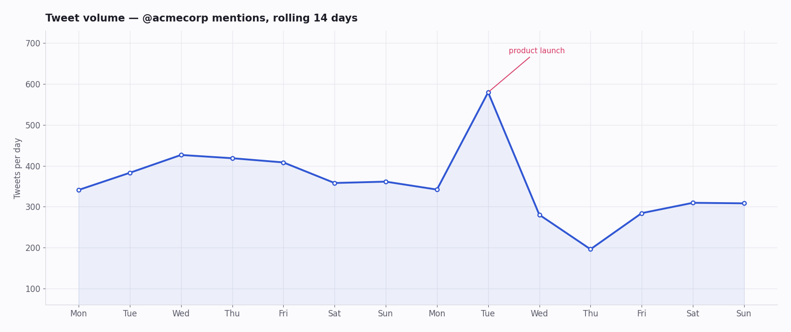
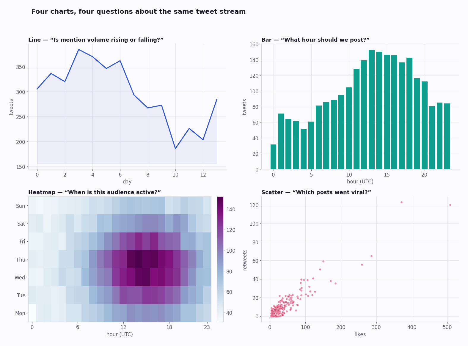
Tweet volume over time — group tweets into time buckets and count; render as a line or bar. Shows the rhythm of a topic and the best hours to publish into it.
Time-of-day heatmap — bucket by hour-of-day against day-of-week; render as a grid. The two-dimensional version of volume, and the clearest read on when an audience is actually awake.
Sentiment over time — classify each tweet (a lightweight model such as VADER, or a transformer sentiment pipeline) into positive / negative / neutral, then plot a stacked area. This is the brand-health curve.
Engagement scatter — one point per tweet, likes on one axis and reposts on the other. The upper-right outliers are your viral posts; the cluster near the origin is the baseline. A log scale keeps both visible.
Hashtag growth curve — count unique authors using a tag per day and plot the cumulative total. A steep early slope is organic adoption; a vertical jump often is not.
Follower delta — record an account's follower count daily (via a user-info endpoint) and plot the day-over-day change, not the raw total. The change is where the signal is — which posts moved the number.
Top-account comparison — for a topic, rank authors by total engagement and render a horizontal bar. Answers "whose voice carried" in a single glance.
Picking a Charting Library
matplotlib — static images for reports and PDFs. Verbose, but it renders anything and the output is a plain file.
plotly — interactive charts that export to a standalone HTML file: zoom, hover, toggle series. The right choice when the chart is for other people to explore.
seaborn — quick statistical plots (distributions, correlations) with sensible defaults; sits on top of matplotlib.
Grafana or Metabase — when you want an always-on dashboard the whole team can open, pointed straight at the database your pipeline fills. This is the endpoint of the Tier-3 build: stages 1–3 on a schedule, the dashboard on top.
What the Data Costs
Charting is cheap; the cost is in pulling the tweets. On a third-party pay-per-call API at about $0.15 per 1,000 tweets, a daily-refresh chart that pulls 50,000 tweets a month costs on the order of a few dollars a month — and there is no subscription, so a quiet month costs almost nothing.
The official X API can return the same data, but for a new developer account it is now metered pay-per-use, billed per post read; the old flat $200/month Basic tier is closed to new signups. For a charting pipeline — which is read-only and bursty — a pay-per-call third-party API is both cheaper and simpler.
The real cost lever is your query. Storing tweets locally (stage 2 above) means you pull each tweet once and re-chart it for free; a tight query — a real engagement floor, a bounded window — keeps the pull small. A broad, unfiltered pull repeated daily is what makes a charting project unexpectedly expensive.
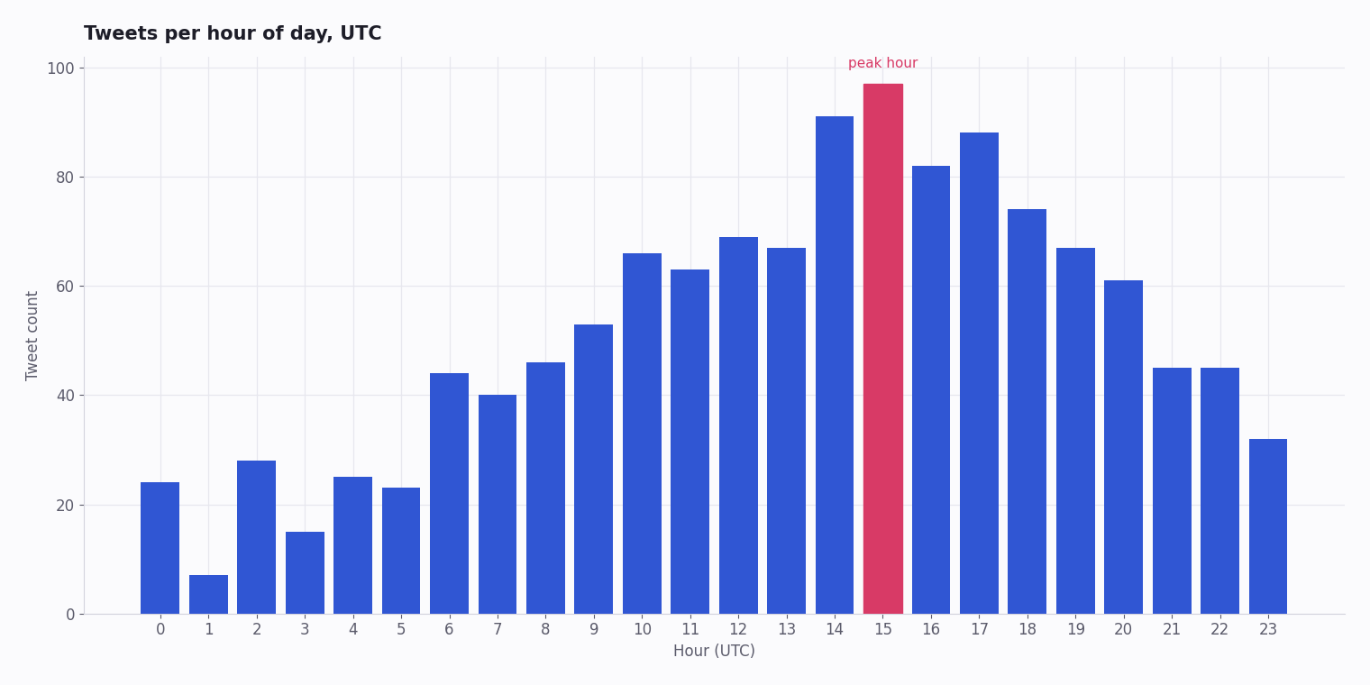
A Working Example: Tweet Volume by Hour
The script below is complete and runnable. It pulls recent tweets matching a search query, pages through the full result set on the cursor, buckets them by hour, and renders a bar chart. Replace YOUR_API_KEY, set a query, and run it — you have a chart in minutes.
It is also the skeleton of every other chart on this page: swap the bucketing step for a sentiment classifier, a unique-author count, or an engagement scatter, and the same pull-and-plot shape produces a different chart.
import requests
from datetime import datetime
from collections import defaultdict
import matplotlib.pyplot as plt

API_KEY = "YOUR_API_KEY"
QUERY = "acmecorp lang:en -filter:retweets"

def pull_tweets(query, max_results=500):
    """Page through advanced search on the cursor until exhausted."""
    out, cursor = [], ""
    while len(out) < max_results:
        params = {"query": query, "queryType": "Latest"}
        if cursor:
            params["cursor"] = cursor
        r = requests.get(
            "https://api.twitterapi.io/twitter/tweet/advanced_search",
            params=params,
            headers={"X-API-Key": API_KEY},
            timeout=30,
        )
        r.raise_for_status()
        body = r.json()
        out.extend(body["tweets"])
        if not body["has_next_page"]:
            break
        cursor = body["next_cursor"]
    return out[:max_results]

tweets = pull_tweets(QUERY)

# createdAt format: "Wed Oct 02 11:11:11 +0000 YYYY"
by_hour = defaultdict(int)
for t in tweets:
    hour = datetime.strptime(t["createdAt"], "%a %b %d %H:%M:%S %z %Y").hour
    by_hour[hour] += 1

hours = sorted(by_hour)
plt.bar(hours, [by_hour[h] for h in hours])
plt.xlabel("Hour (UTC)")
plt.ylabel("Tweet count")
plt.title(f"Tweets matching '{QUERY}'")
plt.savefig("tweet_volume.png")
print("Chart saved to tweet_volume.png")
Questions readers ask
Where can I find free Twitter datasets to chart?
Kaggle hosts thousands of public Twitter datasets — politics, sports, brands, disaster response and more — from ten thousand to a hundred million-plus tweets; the Internet Archive holds large collections too. They are static snapshots, so for a live or up-to-date chart you need an API pull instead.
How do I chart real-time Twitter data?
Run the pull-store-aggregate steps on a schedule — a cron job every few minutes writing tweets into a database — then point a dashboard tool such as Grafana or Metabase at that database. For near-instant updates, a real-time filter rule can push matched tweets to your endpoint as they post.
What's the easiest way to chart Twitter engagement?
Pull a few weeks of tweets for your topic via an API, load them into pandas, group by date, and plot likes, reposts and replies as lines. It is well under an hour of work and costs only a few dollars in API calls. Free creator dashboards also show engagement, but only for preset views you cannot customise.
Can I chart trending hashtags over time?
Yes. Poll a trends endpoint on a schedule, save each trend-list snapshot with its timestamp, and plot a hashtag's rank trajectory across the snapshots. It is a good way to measure campaign velocity or to spot the unnaturally sharp climbs that suggest coordinated activity.
What charting library is best for Twitter data in Python?
plotly for interactive charts you want others to explore (zoomable, exportable HTML); matplotlib for static report and PDF output; seaborn for quick statistical plots; and Grafana or Metabase when you want an always-on team dashboard reading from your database.
How much does it cost to chart Twitter data?
The charting itself is free — the libraries are open source. The cost is pulling the tweets: about $0.15 per 1,000 on a third-party pay-per-call API, so a daily-refresh chart pulling tens of thousands of tweets a month runs to a few dollars. Storing tweets locally means you pay for each one once and re-chart for free.
How do I chart sentiment from tweets?
Classify each tweet into positive, negative or neutral with a lightweight model — VADER for speed, a transformer sentiment pipeline for accuracy — attach the label to the tweet's timestamp, then plot a stacked area over time. The result is a readable brand-health curve.
Do I need the official X API to chart Twitter data?
No. A third-party API returns the same public tweet data — text, timestamps, engagement counts, author info — which is everything a chart needs. The official API is only required if you also need write access or official-only metadata, neither of which a charting pipeline uses.
Should I chart straight from the API or store the data first?
Store it first. Charting directly from the API means you re-pull — and re-pay for — the same tweets every time you tweak a chart. Writing tweets into SQLite or PostgreSQL once lets you re-aggregate and re-render as often as you like at no extra cost, and it is what makes a scheduled dashboard practical.
Continue
Stop reading. Start building.
Starter credits cover real testing on real data. Google sign-in, no card, no application queue.
Get an API key