Real-time Twitter Data Visualization: A Beginner's Guide
Real-time Twitter Data Visualization: A Beginner's Guide
Twitter data is a goldmine for tracking trends, public sentiment, and real-time events. Visualizing this data in real-time can help you identify patterns, monitor engagement, and make informed decisions faster. Here’s how to get started:
- Why it matters: Twitter generates massive data streams every second. Tools like real-time dashboards can transform raw metrics (likes, retweets, sentiment scores) into actionable insights.
- Tools to use: Platforms like TwitterAPI.io make it easy to access live data with pay-as-you-go pricing ($0.15 per 1,000 tweets). They offer REST APIs for historical data and WebSocket connections for instant updates.
- How to visualize: Beginner tools like Google Sheets, Looker Studio, or Python libraries (e.g., Pandas) can organize and display data. Use line charts for trends, bar charts for comparisons, and heatmaps for activity patterns.
- Key metrics to track: Retweets, likes, replies, hashtags, and sentiment scores are critical for understanding audience engagement and behavior.
Start simple: Set up a TwitterAPI.io account, connect to live streams, and create basic visualizations to track trends. With the right tools and approach, you can transform endless tweets into insights that matter.
Setting Up TwitterAPI.io for Real-Time Data
Creating Your Account and Understanding Pricing
Getting started with TwitterAPI.io is quick and simple. Head over to twitterapi.io, click on "Sign Up", and provide your email and password. Once you've submitted your details, verify your account through the confirmation link sent to your inbox. After logging in, you'll need to add your billing information to activate pay-as-you-go access. As a bonus, you can test the platform with up to $1.00 in free credits. Your API key will be available right on your dashboard, ready for integration.
The pricing is refreshingly straightforward: $0.15 per 1,000 tweets accessed, with no subscriptions or minimum spending requirements. For example, accessing 10,000 tweets will cost just $1.50. All charges are billed monthly in USD, and invoices use standard US number formatting (e.g., $1,500.00).
For academic users, there's a discounted rate of $0.075 per 1,000 tweets. To qualify, submit proof of your academic affiliation - such as a university email address or student ID - through the "Billing" section in your dashboard. Approval usually takes less than 24 hours, and you'll have access to 24/7 support.
Once your account is set up and you're familiar with the pricing, you're ready to move on to API authentication.
API Authentication and Available Features
After setting up your account, you can generate your API key directly from the dashboard. To authenticate, include this key in every HTTP header as x-api-key: YOUR_API_KEY. This token-based system allows you to start using the API immediately - no lengthy approval processes required.
TwitterAPI.io offers impressive performance, with rate limits of over 1,000 requests per second. This is a major upgrade compared to Twitter's official API, ensuring your real-time visualizations stay responsive even during high-traffic events. The platform guarantees a 99.99% uptime SLA, with response times typically ranging between 500ms and 800ms.
The API includes both REST and WebSocket endpoints. REST endpoints are perfect for historical data and ad-hoc queries, while WebSocket connections (e.g., wss://api.twitterapi.io/stream?query=hashtag) provide live tweet streams with latency under 1 second. This makes WebSocket connections ideal for powering real-time dashboards and charts.
sbb-itb-9cf686c
Fetching Real-Time Twitter Data
Working with REST and WebSocket Endpoints
TwitterAPI.io provides two main methods for accessing live tweet data: REST endpoints for historical searches and WebSocket connections for real-time streaming. REST endpoints use short-lived HTTP requests, making them ideal when you need specific data. On the other hand, WebSocket connections keep a persistent link to deliver new tweets instantly with sub-second latency.
For REST API calls, you'll send standard HTTP requests with your API key included in the header as x-api-key: YOUR_API_KEY. Here's a simple Python example:
import requests

headers = {'x-api-key': 'YOUR_API_KEY'}
params = {'query': '#AI', 'max_results': 100}
response = requests.get('https://api.twitterapi.io/tweets/search', headers=headers, params=params)
tweets = response.json()
If you're looking for live updates, WebSocket is the way to go. By connecting to wss://api.twitterapi.io/stream?query=hashtag, you'll receive JSON objects as tweets are posted. This is particularly useful for real-time dashboards, as the persistent connection ensures new data flows in continuously with minimal delay.
Now, let's dive into the engagement metrics you can extract from these tweets.
Key Engagement Metrics Explained
Understanding how tweets are fetched is just the start - what you do with that data is what really matters. Each tweet retrieved via TwitterAPI.io includes a range of engagement metrics in JSON format. The key fields to focus on are:
retweetCount: Total number of times the tweet has been shared.likeCount: Total number of likes.replyCount: Total number of replies.createdAt: Timestamp of when the tweet was posted.author: Includes details like the username and display name.text: The tweet content.
One thing to note is the naming convention differences between endpoints. WebSocket responses use camelCase (e.g., retweetCount), while Webhook implementations use snake_case (e.g., retweet_count). While the data remains the same, you'll need to account for these variations when processing the responses.
When visualizing this data, these metrics can be fed into charting tools to create meaningful insights. For instance:
- A line chart tracking
likeCountover time can show engagement trends. - Comparing
retweetCountfor multiple tweets can highlight which posts are resonating most with your audience.
The API provides all engagement metrics at the moment they are captured, giving you a real-time snapshot of a tweet's performance. To monitor trends over time, you'll want to store these metrics along with their timestamps. This helps you analyze how engagement evolves, offering a clearer picture of a tweet's impact beyond its initial hours.
Choosing Visualization Tools and Chart Types
Beginner-Friendly Visualization Tools
If you're just starting out, Google Sheets is a great option for visualizing Twitter data. It's free, requires no installation, and offers tools to organize, filter, and analyze metrics without needing advanced software skills. By using the API Connector add-on, you can easily connect TwitterAPI.io's REST API to import data directly into your spreadsheet - no coding required. For more automation, you can use Google Apps Script with UrlFetchApp to streamline data imports.
For those who prefer pre-made visual reports delivered straight to their inbox, Metrics Watch is worth considering. Starting at $29/month, it simplifies Twitter reporting without requiring you to set up dashboards. As Apostolos Tsiter, Product Owner at onvista, shared:
Metrics Watch was the only tool that met our requirements regarding both functionality and usability.
Another free and powerful option is Google Looker Studio (formerly Google Data Studio). It connects to hundreds of data sources and supports refresh intervals as frequent as 1 minute when paired with BigQuery.
To prepare your raw JSON data for visualization, you can use Google Sheets functions like TRIM(), SPLIT(), and SUBSTITUTE() to clean and standardize text. Additionally, use the since_id parameter when fetching data via REST API to avoid importing duplicate tweets.
Once your data is organized, the next step is selecting the appropriate chart type to effectively showcase your metrics.
Matching Chart Types to Your Data
Choosing the right chart type depends on the kind of data you want to present. For example:
- Line charts are ideal for tracking trends over time. Use them to plot metrics like
likeCountorretweetCountacross days or weeks, helping you identify spikes and understand which content resonated most. - Bar charts are great for making comparisons. For instance, you can compare engagement levels across your last 10 tweets or analyze performance by tweet type.
- Heatmaps help you uncover patterns, such as peak engagement hours when your audience is most active.
- Summary charts provide quick, high-level snapshots. They work well for displaying single metrics like total impressions or follower counts, often paired with percentage changes from the previous period.
- Tables are perfect for detailed breakdowns, such as filtering your "Top 10 Most Retweeted Posts" to see what content stands out.
Here's a quick reference guide to help match chart types with specific use cases:
| Chart Type | Best Use Case | Metrics Displayed |
|---|---|---|
| Line Chart | Trend analysis over time | Follower growth, engagement rate changes |
| Bar Chart | Comparisons across posts or periods | Top-performing content, engagement by tweet type |
| Heatmap | Pattern recognition | Peak engagement times, geographic activity |
| Summary Chart | Single high-impact value | Total impressions, total follower count |
| Table | Detailed ranking or sorting | Top mentions, most retweeted posts |
Selecting the right visualization not only makes your data easier to understand but also highlights the insights that matter most for your strategy.
Tweet Visualization and Sentiment Analysis in Python - Full Tutorial
Building Real-Time Dashboards
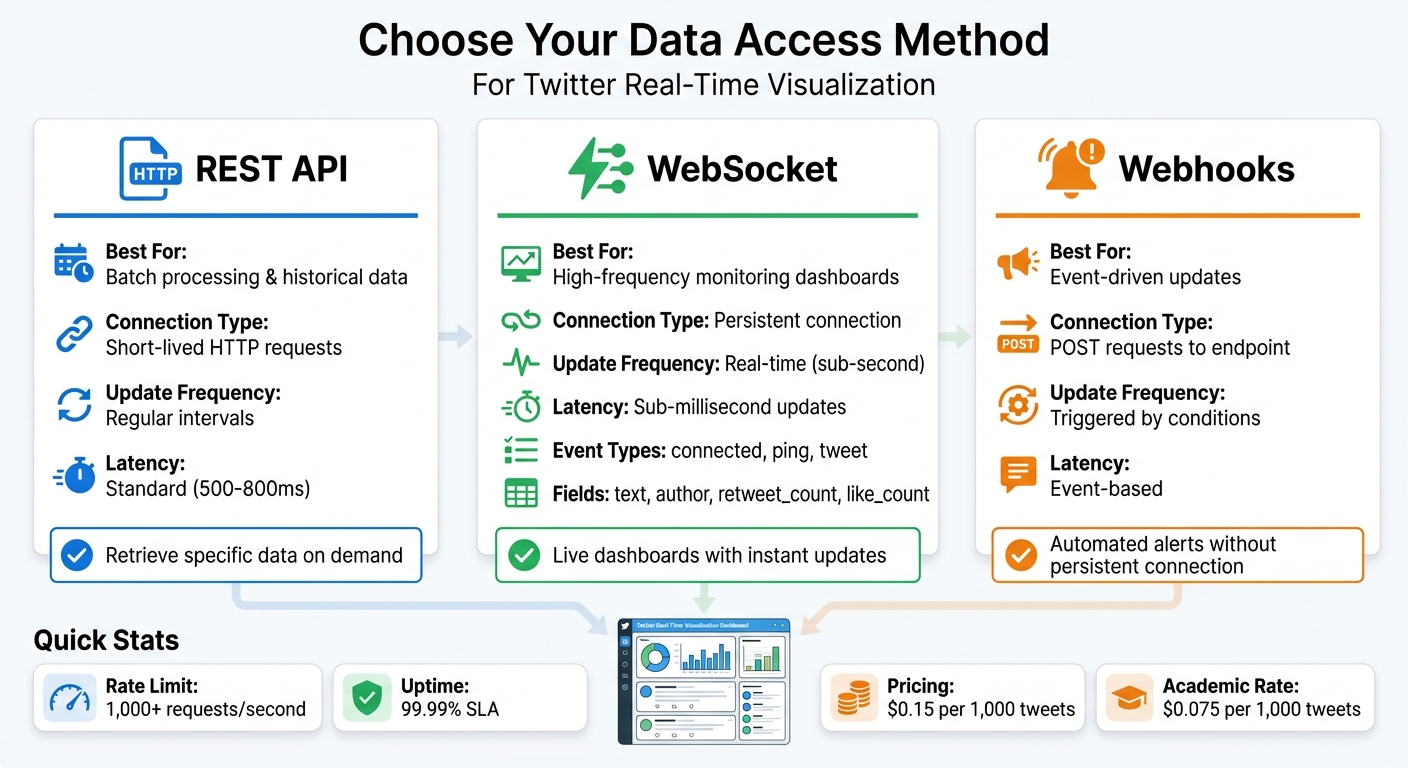
TwitterAPI.io Data Access Methods Comparison: REST API vs WebSocket vs Webhooks
Connecting Live Data Streams to Your Dashboard
After selecting your visualization tools, the next step is integrating TwitterAPI.io's live data streams into your dashboard. You can choose from three main methods: REST API, WebSockets, or Webhooks. The right choice depends on how quickly you need updates and the technical requirements of your setup.
-
WebSockets: Ideal for high-frequency monitoring dashboards, this method provides sub-millisecond updates by maintaining a persistent connection. It streams event types like
connected,ping, andtweet, along with fields such astext,author,retweet_count, andlike_count. - Webhooks: This option simplifies integration by sending event-driven POST requests to your endpoint whenever specific conditions are met. It avoids the need for a persistent connection.
- REST API: Best suited for batch processing or retrieving historical data at regular intervals, this method uses straightforward HTTP requests.
To prepare the incoming data for visualization, you’ll need to process the raw JSON tweet data into structured formats. Tools like Pandas in Python make it easy to extract metrics such as retweet_count, like_count, and reply_count for your charts. For cleaner visualizations, frameworks like Bytewax can help transform real-time data by removing unnecessary content with regex.
Once your data stream is connected, the focus shifts to refining the data for actionable insights.
Filtering and Analyzing Your Visualizations
With live data streaming into your dashboard, the next challenge is to filter and analyze the tweets to extract meaningful insights. Without filtering, the sheer volume of data can overwhelm your dashboard. Pre-processing the data before it reaches your charts is crucial. One effective technique is windowed aggregation, where you use "window operators" (e.g., 1-minute tumbling windows) to group and analyze data, such as counting word frequencies or tracking sentiment changes over time.
For enhanced insights, apply sentiment analysis using Natural Language Processing (NLP) tools like TextBlob or Spacy to classify tweets as positive, negative, or neutral in real time. As Zander Matheson, CEO and Founder of Bytewax, notes:
Real-time data processing and analysis involves processing and getting insights from raw data as it is received.
This method is particularly helpful for spotting sudden shifts in audience sentiment, which can indicate potential brand crises or positive trends in the market. Research also highlights a strong correlation (0.97) between general engagements and media engagements, showing that tweets with media significantly boost interaction rates.
To make your dashboard more user-friendly, use tools like VLOOKUP to convert numerical Twitter User IDs into readable names and metadata. Additionally, analyzing "impressions by hour" can reveal when your audience is most active, helping you optimize engagement strategies.
Conclusion
Visualizing real-time Twitter data has become much easier, even for beginners. The process is simple and involves a few key steps:
- Sign up for free trial credits.
- Quickly authenticate using your API key.
- Fetch live metrics through WebSocket streams.
- Use beginner-friendly tools to create visualizations.
- Build dashboards with custom filters for hashtags or users.
These steps allow you to access real-time data without breaking the bank. Platforms like TwitterAPI.io offer a cost-efficient alternative to official Twitter API tiers, with a 99.99% uptime guarantee. Their pay-as-you-go pricing model, combined with higher rate limits, eliminates the need for complex approvals or restrictive limitations. With sub-second updates from WebSocket streams, you can track trends as they happen.
Once your dashboard is live, the true value lies in using that data to drive immediate action. For instance, one marketing team reported a 200% increase in retweets after targeting regions responsible for 60% of their traffic, which led to a 25% rise in conversions. Real-time visualization can cut analysis time by 70% and improve engagement by 30–50%, based on metrics like interaction rates.
To get started, try setting up a WebSocket stream for a specific topic and create a basic line chart to track impressions. Apply filters based on your local time zone and focus on key performance indicators like hourly engagement growth. Adjust your strategy based on the insights you uncover. These small steps can provide actionable insights - like determining the best posting times or identifying sentiment shifts - helping you connect with your audience more effectively than ever.
FAQs
How do I avoid duplicate tweets in my dashboard?
To keep your dashboard free of duplicate tweets, implement a deduplication strategy during data processing. Focus on checking for unique tweet IDs and remove duplicates by confirming whether an ID is already present in your dataset or cache. This approach ensures that only unique tweets make it to the display. Integrating deduplication into the data normalization stage is especially effective, as it helps maintain clean and accurate visualizations.
Should I use REST or WebSocket for real-time charts?
When it comes to building real-time charts with Twitter data, WebSocket stands out as the go-to option. Here's why:
WebSocket provides a persistent connection between the client and server. This means data can flow continuously without the need to repeatedly establish new connections. It also boasts low latency, ensuring updates are nearly instantaneous. Plus, with its ability to enable server push, updates are sent to the client immediately as they happen, cutting down on unnecessary network requests and reducing overall network overhead.
In contrast, REST APIs rely on polling, where the client repeatedly requests updates at regular intervals. This approach not only introduces higher latency but also increases the load on servers, making it less efficient for real-time scenarios.
For applications like real-time charts, where speed and efficiency are key, WebSocket is the clear winner. It ensures smooth, instant updates that are essential for keeping your data visualizations accurate and up-to-date.
How can I store tweet metrics to track changes over time?
To keep track of tweet metrics, you can use TwitterAPI.io's endpoints to gather data such as engagement rates, hashtags, mentions, or follower counts. Once retrieved, this information can be stored in a database or structured file formats like CSV or JSON for easy access and historical analysis.
For ongoing tracking, you can automate data collection by setting up APIs or webhooks. This allows you to monitor trends over time seamlessly. For example, you could create a dashboard that refreshes hourly or daily, offering a clear visualization of metric changes as they happen.
Tags
Related articles
Ready to get started?
Try TwitterAPI.io for free and access powerful Twitter data APIs.
Get Started Free